How to actually make a quality scatterplot in R
A step-by-step tutorial introduction to publication-quality scatterplots for the beginner and advanced alike

Scatterplots are one of the most common types of data visualizations you will encounter as a biologist. They present the relationship between two continuous variables. We might take them for granted by their simplicity, but we shouldn’t assume the seeming intuition with which we can see and comprehend these figures. They are a powerful tool, but one that I believe merits a bit more attention. Check out this really cool article from the New Yorker about ‘When graphs are a matter of life and death’ for more history on the subject.
All through my grad school years and beyond, I’ve repeatedly come across scatterplots that almost defeat the purpose of helping us easily understand the relationship between two variables. Here’s a typical example of the type of plot I’ve seen one-too-many times:
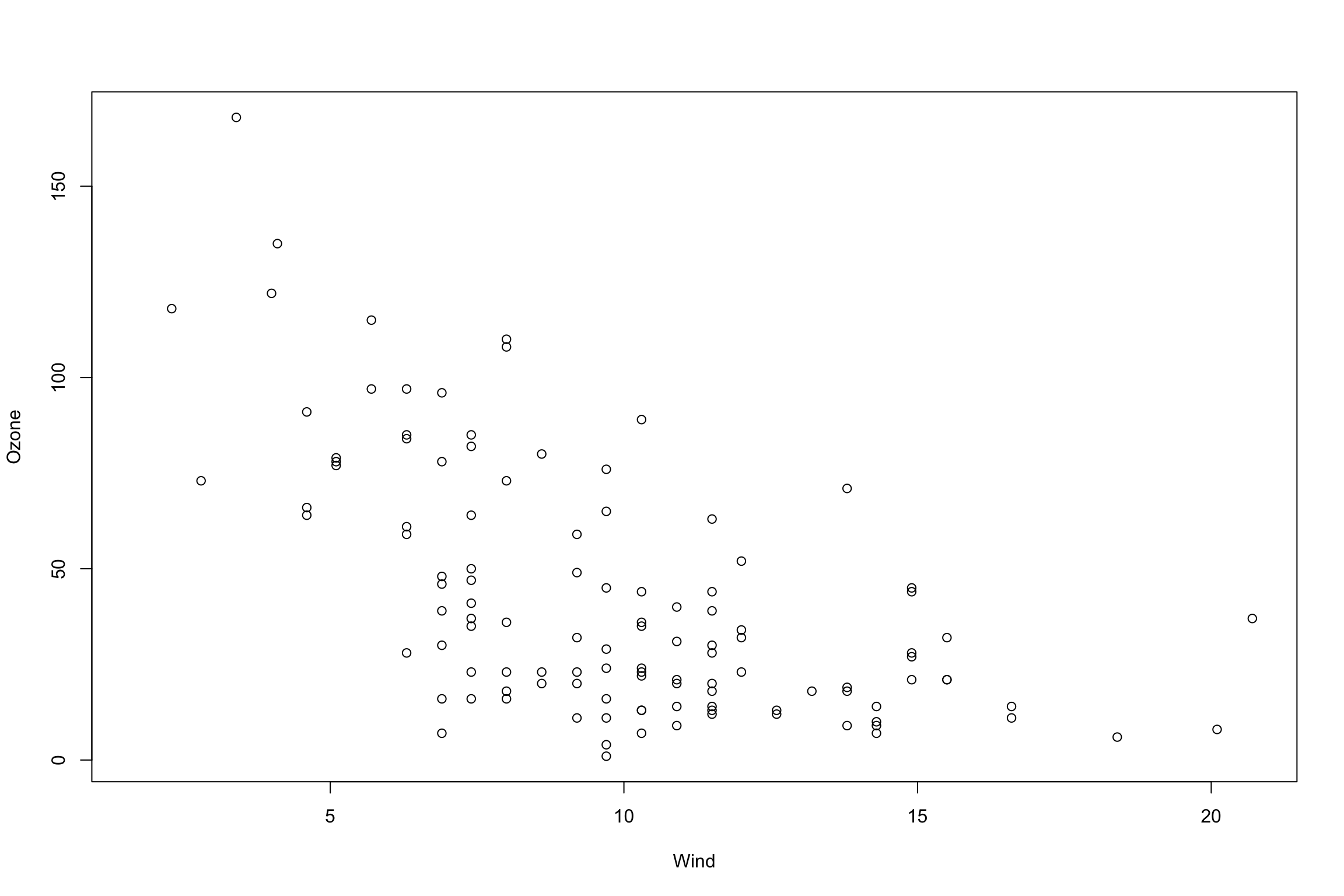
There are several issues here, but without elaborating, here are the same data after a few visual tweaks:
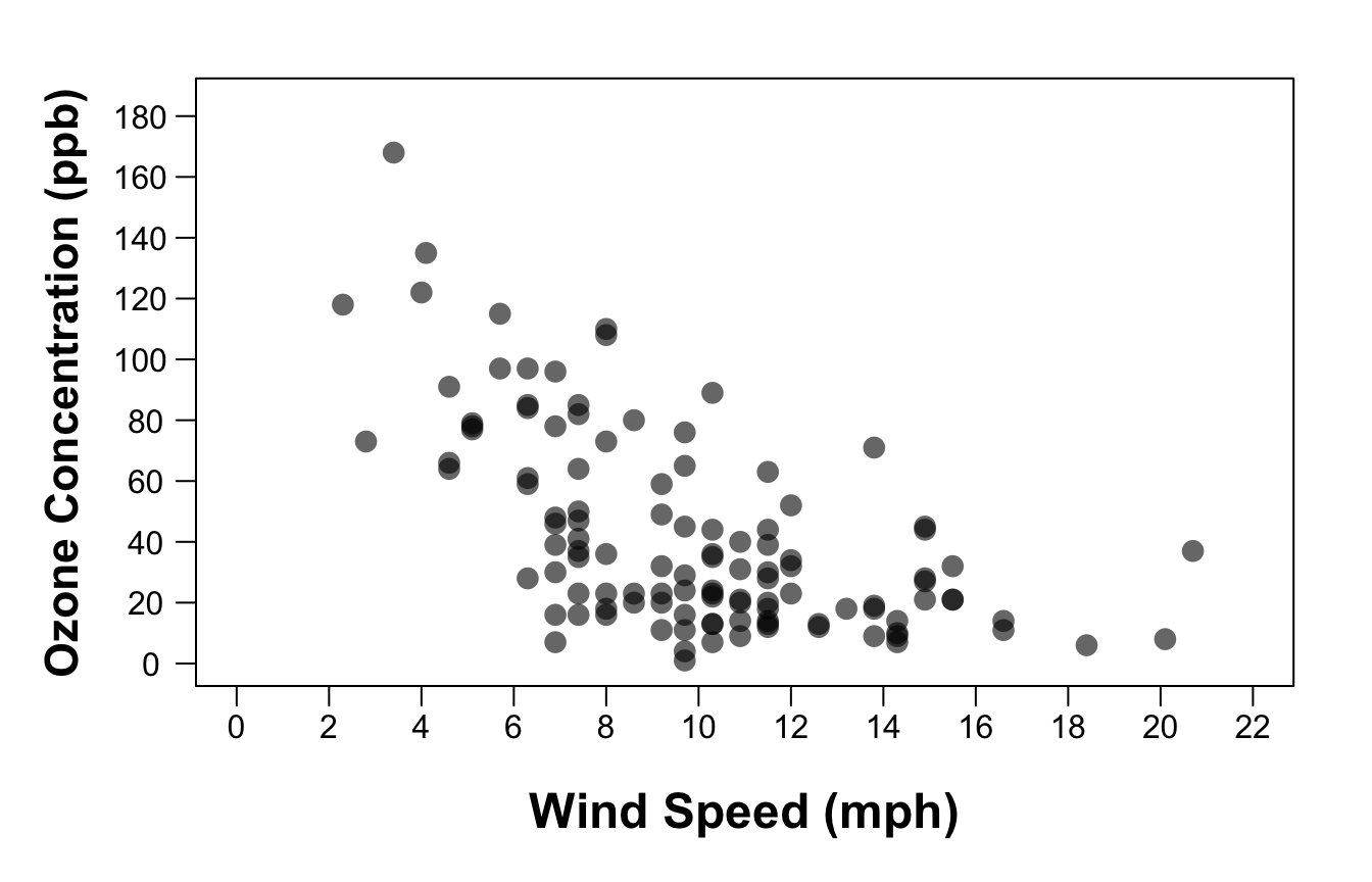 Much more striking and easy to read, no?
In other words, while the data may be accurate, the actual visual design of scatterplots is often overlooked and unattended. Unlike a statistical test, the goal of data visualizations is subjective—to help a viewer understand a particular relationship or story. For that reason, it is important that we take a subjective, and dare I say aesthetic, approach towards ensuring scatterplots (and all other plot types, really) are visually appealing and easy to understand on a quick glance.
I have a hunch that the main reason plots such as the first one above are so common is simply due to a lack of knowing how to easily customize plots in R. Unfortunately, even ggplot2—which is commended for the ease with which one can make good quality visualizations—is not so pretty right out of the box.
Hence this blog post ;)
Here is a simple tutorial on how to re-create the nice version of the plot above using the ‘base’ R package. The key is just to include a few additional parameters and functions. In the future I may update this post with how to do this using ggplot2.
First, let’s load the data. In this case we are using the built-in dataset on air quality measurements in New York from May through September in 1973:
# Load the built-in data:
data(airquality)
help(airquality)

head(airquality)
##   Ozone Solar.R Wind Temp Month Day
## 1    41     190  7.4   67     5   1
## 2    36     118  8.0   72     5   2
## 3    12     149 12.6   74     5   3
## 4    18     313 11.5   62     5   4
## 5    NA      NA 14.3   56     5   5
## 6    28      NA 14.9   66     5   6
For this tutorial we are only interested in ozone concentration, which is measured in parts per million (ppm), and wind speed, which is measured in miles per hour (MPH). To get this info, I just ran the ‘help(airquality)’ function to pull up a description of these data.
Next, let’s start with the plot created using the ‘plot()’ function right out of the box:
plot(Ozone ~ Wind, data=airquality)
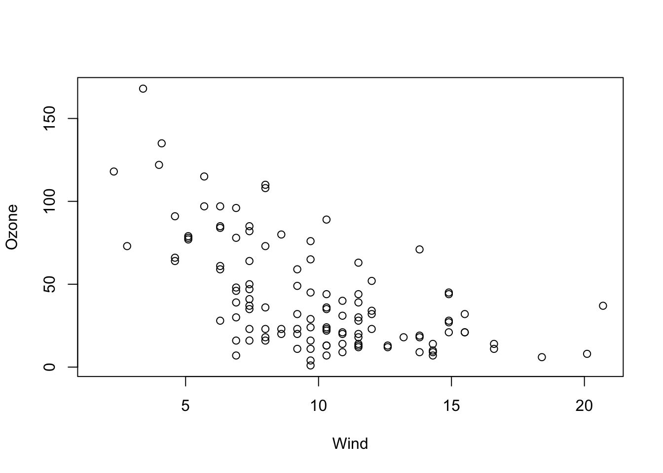 Which ever variable you want on the Y-axis goes to the left of the tilde ‘~’ and the X-axis goes on the right of the tilde. The neat thing about this notation is that you can just directly use the column names of the data you’d like to plot. In this case we set the ‘data’ argument to our dataframe ‘airquality’, and ‘Ozone’ and ‘Wind’ were the column names taken right from that dataframe.
Next, remove all the axes and tick marks from the plot so that we can start with a clean slate:
plot(Ozone ~ Wind, data=airquality, xaxt="n", yaxt="n", ylab="", xlab="")
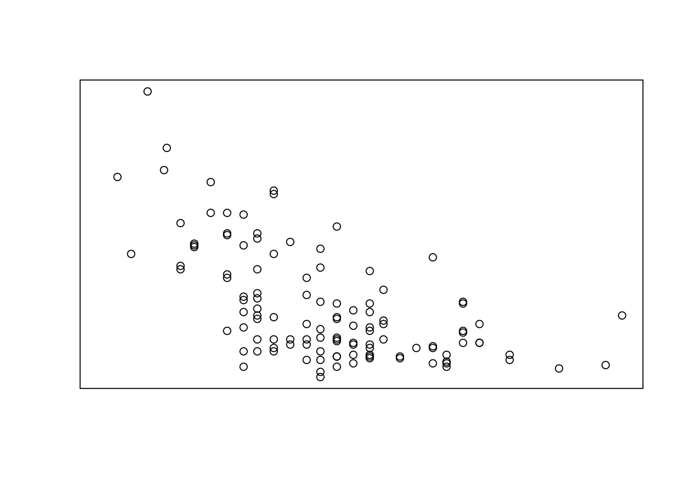 Then we’ll add back new axes that are fully customizable using the ‘axis()’ function:
plot(Ozone ~ Wind, data=airquality, xaxt="n", yaxt="n", ylab="", xlab="")
# add the wind speed axis:
axis(side=1, at=seq(0, max(airquality$Wind, na.rm=T), 2), padj=-0.8)
# add the Ozone axis:
axis(side=2, at=seq(0, max(airquality$Ozone, na.rm=T), 20), hadj=0.8, las=2)
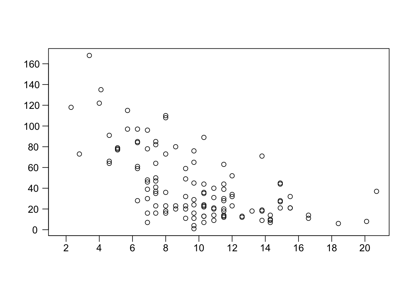 The ‘side’ argument indicates what side of the graph we are adding the axis on. Sides 1, 2, 3, and 4 are the bottom, left, top, and right, respectively. Then, ‘at’ is where we tell the function where to put the axis ticks. For example, here is what we use for that argument:
# This finds the maximum value for wind:
max(airquality$Wind, na.rm=T)
## [1] 20.7
# Then use that in the 'seq()' function to create the sequence of places for the tickmarks:
seq(from = 0, to = max(airquality$Wind, na.rm=T), by = 2)
## [1] 0 2 4 6 8 10 12 14 16 18 20
The ‘padj’ and ‘hadj’ (perpendicular adjust and horizontal adjust) arguments are used to nudge the axis tickmark label text so that it lines up more neatly. Play around with those values to see what you get. Finally, the ‘las’ argument when set to 2, turns the y axis tick marks horizontally so that they are more easily readable and all fit on the axis neatly.
Next, add in the axis name labels using the ‘mtext’ function. It’s always important to add units to these labels, which I did. The ‘line’ argument is how far from the edge of the plot you want the label to appear. ‘cex’ affects the size of the text, and finally, ‘font’ is used to make the text bold. You can set ‘font’ to 1, 2, 3, or 4, for normal, bold, italic, or italic + bold respectively. Play around with all those parameters to see how it changes the figure.
plot(Ozone ~ Wind, data=airquality, xaxt="n", yaxt="n", ylab="", xlab="")
# add the wind speed axis:
axis(side=1, at=seq(0, max(airquality$Wind, na.rm=T), 2), padj=-0.8)
# add the Ozone axis:
axis(side=2, at=seq(0, max(airquality$Ozone, na.rm=T), 20), hadj=0.8, las=2)
# add in the labels for each axis:
mtext(side=1, "Wind Speed (mph)", line=2.8, cex=1.5, font=2)
mtext(side=2, "Ozone Concentration (ppb)", line=2.8, cex=1.4, font=2)
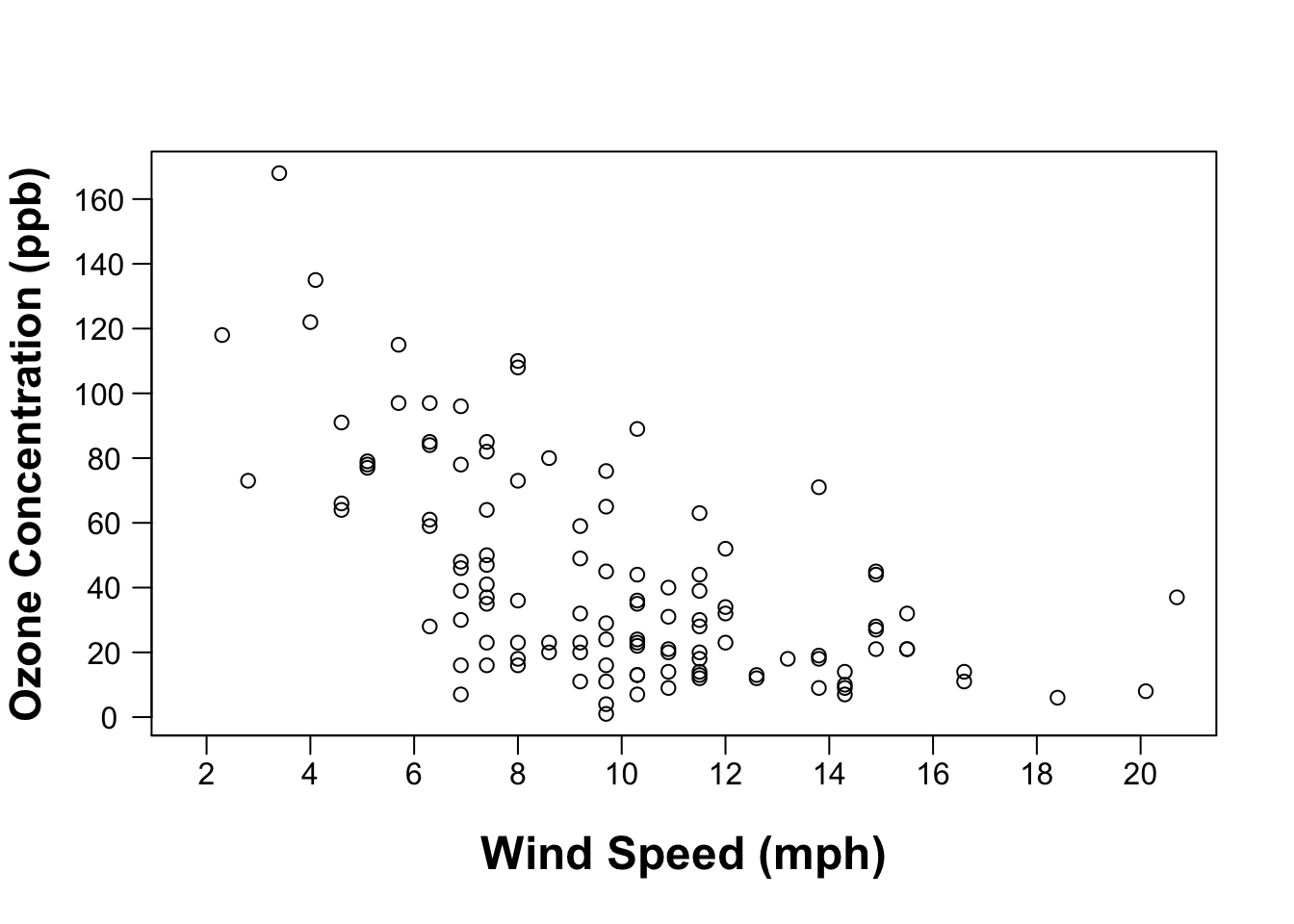 Now that we have all the elements there, let’s adjust the points a bit. I’m really not a fan of the circle outline points. Something about it just doesn’t give the emphasis I want to see in the figure (feel free to disagree!). Instead, I prefer to fill in the points using the ‘pch = 16’ argument, and then make them a bit bigger with the ‘cex’ argument (both in the ‘plot()’ function):
plot(Ozone ~ Wind, data=airquality, xaxt="n", yaxt="n", ylab="", xlab="", pch=16, cex=1.5)
# add the wind speed axis:
axis(side=1, at=seq(0, max(airquality$Wind, na.rm=T), 2), padj=-0.8)
# add the Ozone axis:
axis(side=2, at=seq(0, max(airquality$Ozone, na.rm=T), 20), hadj=0.8, las=2)
# add in the labels for each axis:
mtext(side=1, "Wind Speed (mph)", line=2.8, cex=1.5, font=2)
mtext(side=2, "Ozone Concentration (ppb)", line=2.8, cex=1.4, font=2)
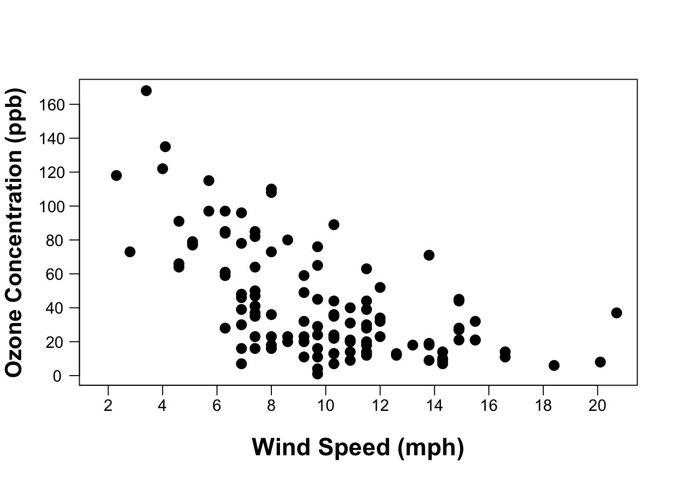 I think that looks a lot better. The only problem here is that a lot of points overlap so you loose the ability to see those clusters. To fix that we can make the point color transparent. This is actually very easy to do using the ‘ggplot2’ package, but we can also do it with the ‘base’ package—it just takes a bit more code. I made a function to make creating transparent colors a bit easier:
### transparent colors function
t_col <- function(color, opacity = 0.5) {
  rgb.val <- col2rgb(color)
  t.col <- rgb(rgb.val[1], rgb.val[2], rgb.val[3], max = 255, alpha = (opacity)*255)
  invisible(t.col)
}
This function essentially takes in two arguments: ‘color’ which is the color you want to make transparent, and then ‘opacity’ which goes from 0 to 1, with 0 being totally transparent, and 1 being no transparency. Adding this function to our plot looks like this:
plot(Ozone ~ Wind, data=airquality, xaxt="n", yaxt="n", ylab="", xlab="", pch=16, cex=1.5,
     col=t_col("black",0.6))
# add the wind speed axis:
axis(side=1, seq(0, max(airquality$Wind, na.rm=T), 2), padj=-0.8)
# add the Ozone axis:
axis(side=2, at=seq(0, max(airquality$Ozone, na.rm=T), 20), hadj=0.8, las=2)
# add in the labels for each axis:
mtext(side=1, "Wind Speed (mph)", line=2.8, cex=1.5, font=2)
mtext(side=2, "Ozone Concentration (ppb)", line=2.8, cex=1.4, font=2)
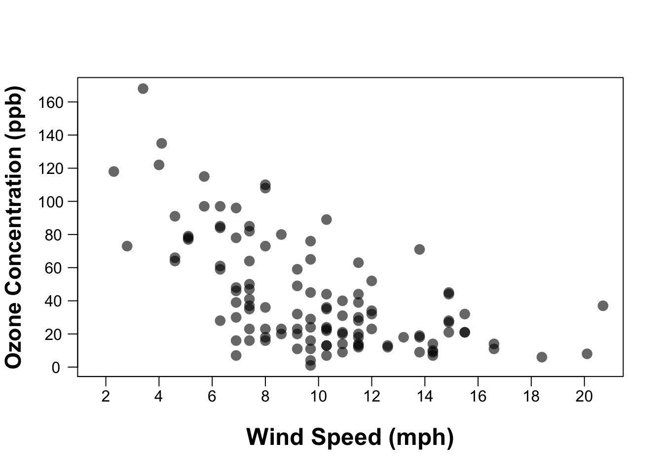 Almost done! I like to add a bit of white space around the edges of the points so that they don’t experience any “edge effects” and allow you to figuratively “stand back” when looking at all of the data. There’s also no reason windspeed shouldn’t start at zero since we’re close to that anyway. So to add that spacing and extend the axes, we just change the axis limits using the ‘xlim’ and ‘ylim’ arguments in the ‘plot()’ function. They each take a vector of two values that indicate the minimum and maximum extent of each axis:
plot(Ozone ~ Wind, data=airquality, xaxt="n", yaxt="n", ylab="", xlab="", pch=16, cex=1.5,
     col=t_col("black",0.6), ylim=c(0,185), xlim=c(0,22))
# add the wind speed axis:
axis(side=1, seq(0, max(airquality$Wind, na.rm=T), 2), padj=-0.8)
# add the Ozone axis:
axis(side=2, at=seq(0, max(airquality$Ozone, na.rm=T), 20), hadj=0.8, las=2)
# add in the labels for each axis:
mtext(side=1, "Wind Speed (mph)", line=2.8, cex=1.5, font=2)
mtext(side=2, "Ozone Concentration (ppb)", line=2.8, cex=1.4, font=2)
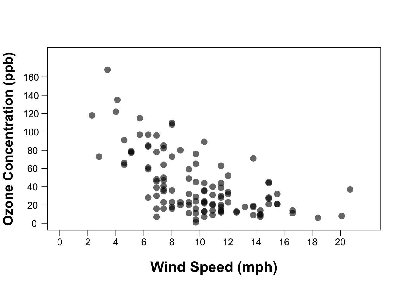
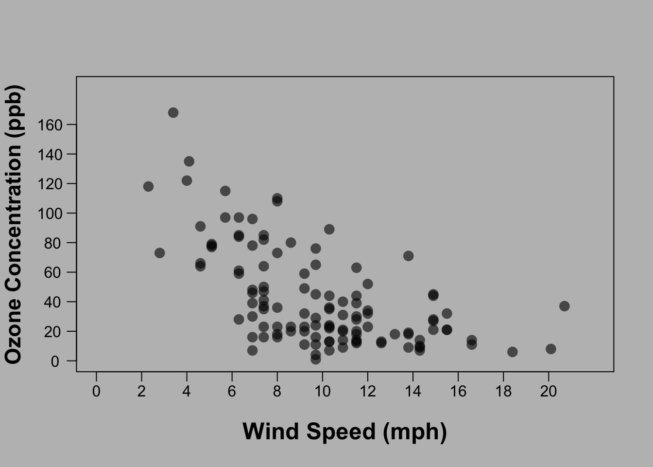
We’ll end by using the ‘par()’ function to set the margins of the plot. I don’t like how close the Y axis label is to the edge of the figure. The ‘mar’ argument is to set the margins around the edge of the figure. I’m not sure what units those are in, but play around with the numbers until you get something that looks good. The four values in the vector represent the four sides in the same order as the ‘side’ argument used for the axes: bottom, left, top, and right:
Here is the plot again with a background color so that you can see what I mean:
And after we added the ‘par(mar=c(5,5,2,2))':
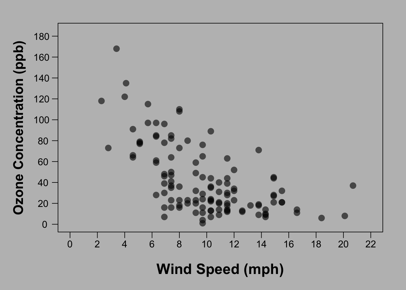 That looks good! So here is the final code:
par(mar=c(5,5,2,2))
plot(Ozone ~ Wind, data=airquality, xaxt="n", yaxt="n", ylab="", xlab="", pch=16, cex=1.5,
     ylim=c(0,185), xlim=c(0,22), col=t_col("black",0.6))
mtext(side=1, "Wind Speed (mph)", line=2.8, cex=1.5, font=2)
axis(side=1, seq(0, max(airquality$Wind)+2, 2), padj=-0.8)

mtext(side=2, "Ozone Concentration (ppb)", line=2.8, cex=1.4, font=2)
axis(side=2, at=seq(0, 185, 20), hadj=0.8, las=2)
Finally (and maybe most importantly), when you save your figure by clicking ‘Export’ above the ‘Plots’ pane in R Studio, you’ll have the option to resize the figure dimensions and see a preview of how it looks with different dimensions. Don’t neglect the important step of ensuring the figure dimensions are set to a size that considers the proportion of all the elements in the figure. Just play around with the sizing and you’ll see what I mean. This is what you are going for:
 Not this:
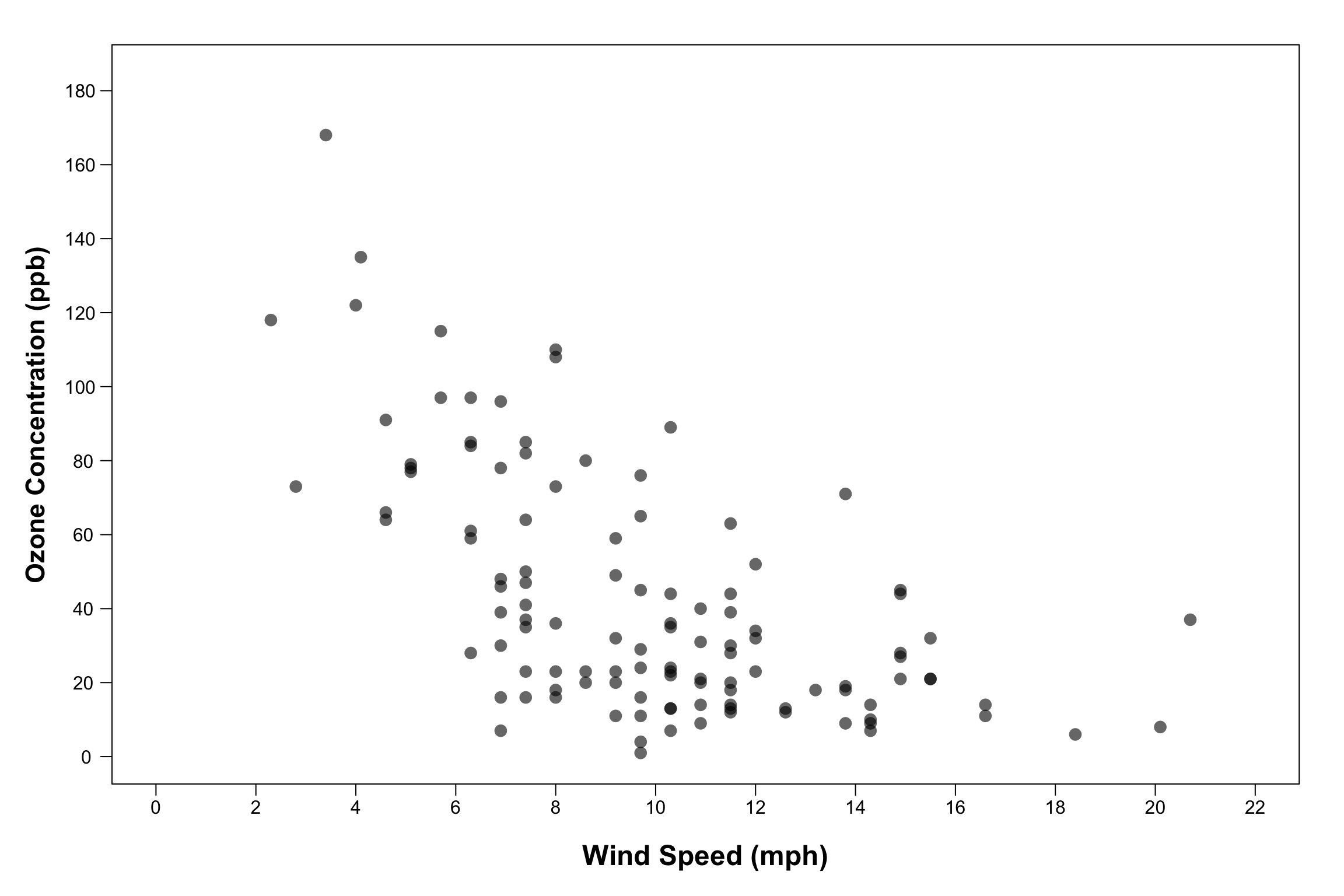
Alternatively, if you want the image size to also remain in the code, create a ‘quartz()’ window (if using a mac) or windows() window (if using a PC). Set ‘height’ and ‘width’ in those functions to the desired size (I believe the units are inches) and run that function before the code that creates the plot. This will open up an external graphics window that is sized to your specifications and you can then go to the file menu at the top of your screen to save the figure as a PDF.
You can also save directly to a graphic window file. Here is the final code for how to do this:
pdf(file="my_scatterplot.pdf",width=7,height=4.5)

par(mar=c(5,5,2,2))
plot(Ozone ~ Wind, data=airquality, xaxt="n", yaxt="n", ylab="", xlab="", pch=16, cex=1.5,
     ylim=c(0,185), xlim=c(0,22), col=t_col("black",0.6))
mtext(side=1, "Wind Speed (mph)", line=2.8, cex=1.5, font=2)
axis(side=1, seq(0, max(airquality$Wind)+2, 2), padj=-0.8)

mtext(side=2, "Ozone Concentration (ppb)", line=2.8, cex=1.4, font=2)
axis(side=2, at=seq(0, 185, 20), hadj=0.8, las=2)

dev.off()
Simply use the ‘pdf()’ function to set the name of the file and directory where it will be saved and specify the height and width in inches. You can play around with those measurements until you find something that works. Then run the code that creates the plot. And finally, run ‘dev.off()’ to close that graphic device.
I recommend always saving your figures as PDFs to retain maximum quality. Check out this other excellent blog post by David Smith with more details about how and why to save your figures in particular formats.
Well done! That’s it for now. Do you think this is easier to do with ggplot? I’ll follow up with an update or post on that as well.
If you liked this article, let me know what you might want to see next in the comments down below.
Also be sure to check out R-bloggers for other great tutorials on learning R
Helpful tutorial. Thanks. However, your final graph style violates a best practice recommendation that scatterplots should have square aspect ratio.
Thanks for your note. As far as I know, the square aspect ratio is only recommended for certain types of plots, such as ones where you have the same units on both axes. Do you mind elaborating on this? Perhaps I misunderstood what you meant by square aspect ratio?
I think my assertion on the square aspect ratio (1:1) comes from Cleveland's classic texts, which were based on his work with McGill on graphical perception. Cleveland, W. S. (1985). The elements of graphing data. Wadsworth Publ. Co.. Cleveland, W. S. (1993). Visualizing data. Hobart Press.
But other opinions exist, e.g.,: Fink, M., Haunert, J. H., Spoerhase, J., & Wolff, A. (2013). Selecting the aspect ratio of a scatter plot based on its delaunay triangulation. IEEE transactions on visualization and computer graphics, 19(12), 2326-2335.
That's great. Thanks for sharing those references!
Instead of using
there is a much shorter alternative using the argument
directly within the
plotfunction.That is a great suggestion, thanks! I didn't know about the adjustcolor() function.