Making your first plot in R
How to create a basic scatterplot from scratch

With the new year, I’m hoping more of you take up learning R, so with that I want to share a tutorial from my course on an introduction to data visualization with R to help get you started.
If you are completely new to R and don’t even know where to start, check out my last post on installing R and RStudio here.
In this tutorial I’ll teach you how to create a scatterplot using the base R package, which includes all the basic functions and is already installed in R (no need to use any additional packages).
You can also follow along with this blog post in the video tutorial that is part of my course if you click on the thumbnail below:

To start with, we’re going to use some data that’s built into R using the data() function to access it:
# Load data
data(PlantGrowth)

# Look at the beginning and ending 4 rows of data
head(PlantGrowth, 4)
##   weight group
## 1   4.17  ctrl
## 2   5.58  ctrl
## 3   5.18  ctrl
## 4   6.11  ctrl
tail(PlantGrowth, 4)
##    weight group
## 27   4.92  trt2
## 28   6.15  trt2
## 29   5.80  trt2
## 30   5.26  trt2
It looks like we have 30 rows of data and two columns. One column is called “weight”, which represents the dry biomass of each plant in grams. The other column is called “group”, and describes the experimental treatment that each plant is given.
We can also see that there are ten plants in each treatment group. Note that I used $ after the name of the data set to refer to the ‘group’ column in this case:
# View number of rows per treatment group
table(PlantGrowth$group)
##
## ctrl trt1 trt2
##   10   10   10
Let’s add another column to this data set that describes the amount of water that each plant has received throughout its life (in liters). You can just copy and paste these numbers from the code here:
# Add a new column
PlantGrowth$water <- c(3.063, 3.558, 2.233, 3.147, 2.379, 2.106, 2.384, 2.444, 2.492, 3.292,
                       2.732, 2.153, 2.660, 1.938, 3.583, 1.817, 3.494, 2.559, 1.530, 2.372,
                       3.176, 2.611, 3.262, 2.947, 2.523, 2.152, 2.771, 2.878, 2.263, 2.518)
And now if we view our data, we can see that the new column was added.
# View first few rows of data
head(PlantGrowth)
##   weight group water
## 1   4.17  ctrl 3.063
## 2   5.58  ctrl 3.558
## 3   5.18  ctrl 2.233
## 4   6.11  ctrl 3.147
## 5   4.50  ctrl 2.379
## 6   4.61  ctrl 2.106
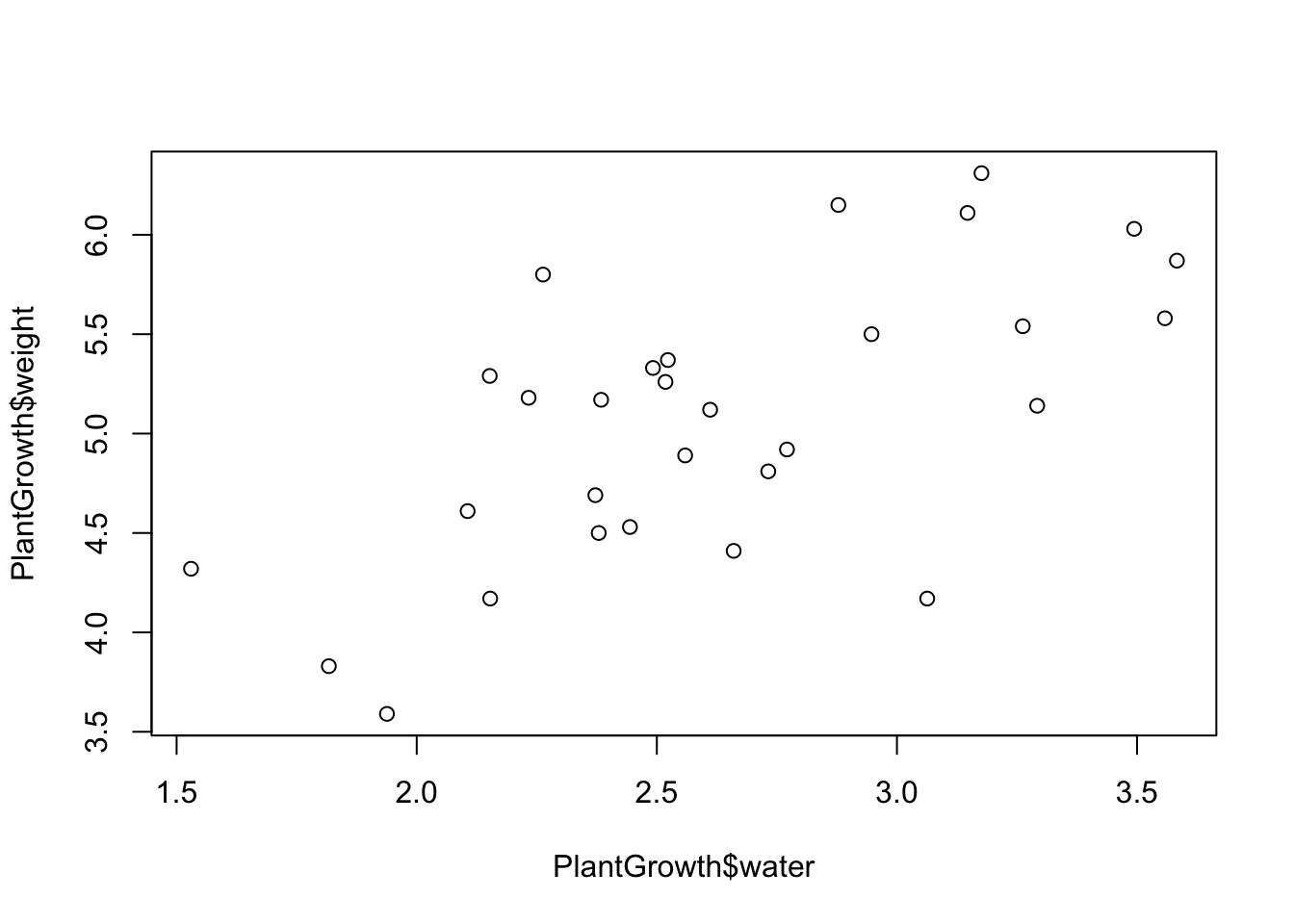
For our first plot, let’s create a scatterplot to see how plant weight varies with the amount of water that the plant has received.
To do this, we’re going to use the plot() function, where you can assign variables to the X and Y axes. Since we want to see how weight varies as a function of water, we’ll put weight on the Y axis and water on the X axis. Remember that we use the dollar sign $ to reference a specific column in a data set.
# Our first plot!
plot(x = PlantGrowth$water, y = PlantGrowth$weight)

And that’s our first plot! You can make the plot smaller or larger by just moving the plot viewing window around.

There’s also another way to use the plot() function, and this method is generally considered the better practice (and will translate to other types of data visualization and analysis techniques).
As we said before, we visualize relationships between the X and Y axes by viewing the Y variable “as a function of” X. If we’re talking in terms of experimental design, the Y axis is the dependent variable (the variable you measure), and the X axis is the independent variable (the variable you control or want to examine the effect of).
The shorthand for “as a function of” is the ~ symbol, or the tilde. The tilde can be found under the Escape key on a keyboard, and you usually have to hold Shift down to type it.
So if we use this with the plot() function, we would just write:
# Plotting plant weight as a function of the amount of water it received
plot(PlantGrowth$weight ~ PlantGrowth$water)

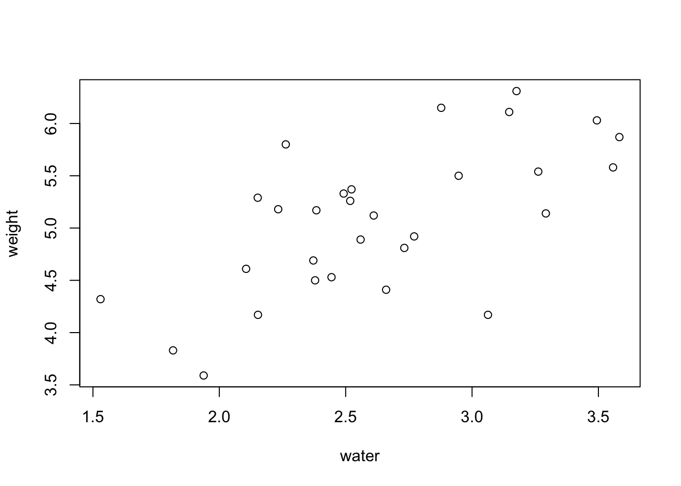
In plain English, we are plotting plant weight as a function of the amount of water it has received. This plot looks exactly the same as the plot that we made earlier, as it should.
We can also make this code simpler by adding another argument to the function. If we specify the data that we want to use, we can just use the column names directly instead of typing out the whole phrase PlantGrowth$water, like so:
plot(weight ~ water, data = PlantGrowth)

So now, the axis labels look much nicer because they just say “weight” and “water” instead of having “PlantGrowth$” in front of both words. Voila! we now we have a basic scatterplot.
In summary, we learned:
How to load in built-in data as well as adding our own custom data as another column in the data set
How to plot a simple scatterplot in base R using the
plot()functionHow to use a tilde in the
plot()function to make the code neater
Best of luck making your first plots using your own data! I hope this tutorial was helpful.
Also be sure to check out R-bloggers for other great tutorials on learning R