Top five(ish) sources of ecological data
A few places where you can download ecological data for coding practice and research
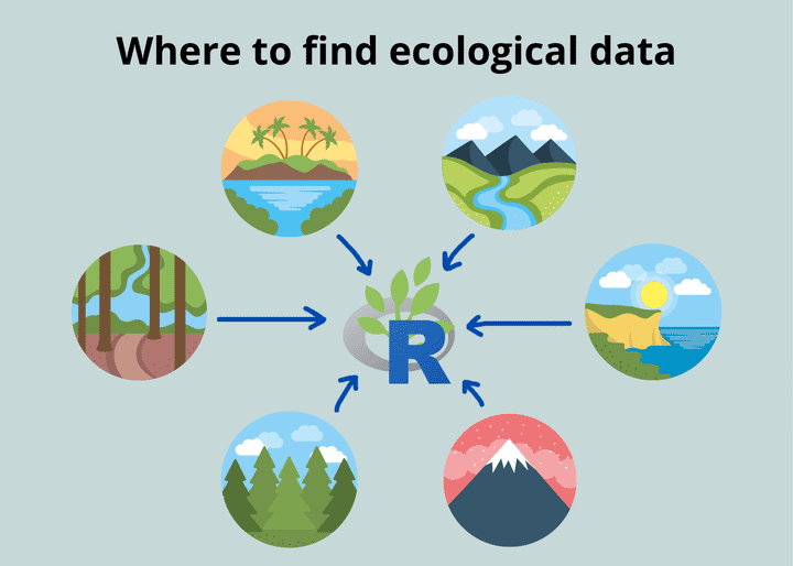
As you’re learning R, it can be hard to come up with data sets that you can practice with. Though many of us have our own data, those might not always be in the best format to do what we want. Our own data are often messy and require a lot of recoding and reformatting. Wouldn’t it be nice if we could download clean data sets that we could work with? Luckily, there are a number of resources out there - you just have to know where to look!
In this tutorial, I discuss the following data sets:
- Data sets that come with R
- The Knowledge Network for Biocomplexity
- The Environmental Data Initiative
- The National Ecological Observatory Network
- The Global Biodiversity Information Facility
I also mention the Ocean Biodiversity Information System, DataOne, and the Central Michigan University Library website’s list of resources.
1) Basic data sets in R
One of the first places you can look for practice data sets is within R itself.
R comes with some standard data sets that you can view if you type data() into the console. These data sets range from describing the survival of Titanic passengers to describing the locations of earthquakes off the island of Fiji. They are wide-ranging and fun to explore, but most of them are not explicitly ecological.
Some common ecological data sets that you might use are iris, PlantGrowth, and Loblolly. I find these data sets useful when I’m trying to do something quick, like testing how a new function works. Since these data sets are so straightforward, I can usually predict what my expected output should be, and then I can know whether or not the function worked correctly. I also use these data sets as examples for the blog posts that I write - these data sets are great teaching tools because they’re fairly simple and easy to understand.
These data sets are not really intended to be used to conduct your own research; they are primarily used for practice and demonstration purposes.

2) The Knowledge Network for Biocomplexity
Introduction and how-to
The Knowledge Network for Biocomplexity (KNB) is an international repository of ecological data sets that have been uploaded by scientists to facilitate environmental research. These data are also often affiliated with published papers.
You can search data sets in a variety of ways. On the left side, you can filter the data based on different attributes (e.g., author, year, taxon, geographic location). On the right side, you can look for data sets by location by navigating the handy world map and clicking on the different squares.

When you click on a data set, you’re taken to a page where you can download all the associated files. The heading at the top is also the citation for the data package, so it’s easy to correctly attribute the work. If you’re using a public data set and publishing something (even if just in a blog post or an example), it’s a good idea to cite the data set.

This page also includes the metadata for the data set to make it easier to navigate and understand the data you’re downloading.
For example, this data set by Haas-Desmarais et al. (2021) comes with great metadata for each file that’s included in the data package. The “observations_complete.csv” file contains several variables, listed on the side. The authors have defined each variable for us - now we know that the variable “actual_time” represents the time listed on the camera and does not reflect the actual time in the world. The metadata also tells us the format / unit of the measurement.

Takeaways and application
One of the great things about KNB data sets is that there’s often a published journal article associated with them (usually linked in the metadata). This allows you to put the data set in the context of the research, and can give you an idea of how you might be able to manipulate the data as you’re practicing your R skills. Maybe reading the article will even raise some questions for you that you might want to explore.
Sometimes the data sets also come with associated R scripts or R Markdown documents that contain the analysis for the paper. This provides a great learning tool where you can see how other scientists conducted their analyses and try to reproduce them.
You can also download data from the KNB through R, using the package rdataone. However, I usually like to download data directly from the site so I can first familiarize myself with the data set.
3) The Environmental Data Initiative
Introduction and how-to
One of my favorite places to download ecological data is the Environmental Data Initiative (EDI) data portal. The EDI archives a lot of environmental data that come from publicly-funded research. The EDI’s specialty is that it is the primary location where data from Long-Term Ecological Research (LTER) sites in the United States are archived. This means that the EDI will often have several years' worth of data for a given data set, making this a great resource for examining long-term trends. For example, the EDI hosts data for a project called “EcoTrends”, which is a large synthesis effort that aggregates ecological data on a yearly or monthly time-scale. The aim of the project is to make long-term ecological data easier to access, analyze, and compare among research sites to evaluate global change. All the EcoTrends data are organized into a common and clean data format (maybe providing good practice for making plots in R?).
As with the KNB, you can browse data in the EDI portal in a number of ways - you can search by LTER site, or based on keywords that the data creators associated with their data set. Some especially useful methods might be to look for data by discipline, by ecosystem, or by organism.

You can also browse data sets by their package identifier, which groups data sets by LTER site or by a specific project (e.g., EcoTrends or the PaleoEcological Observatory Network). Examples of package identifier names include “edi”, “ecotrends”, or “knb-lter-arc”. These codes, in combination with strings of numbers, are used within the EDI to uniquely identify each data set.

The EDI also has an advanced search tool, where you can specify several attributes like geographic location, temporal scale, research site, authors, taxon, etc.
Once you’ve decided on a data set, you’ll be taken to a page that summarizes the data package you’re looking at. This page will provide some basic information like authors, publication date, citation, abstract, and spatial coverage. There will also be a link to download the data, and a link to view the full metadata. Like with the KNB, some data sets come with R scripts that you can run and learn from.

Takeaways and application
Something really neat that the EDI provides on each data package page is a code generator that will read in the data for you and format it appropriately. The EDI will generate code for several different coding languages, like Matlab, Python, R, and SAS. We are of course interested in the “R” and “tidyr” options.

The code under the “R” option will read in the data as a data frame, while the code under the “tidyr” option will read in the data as a tibble, using the tidyverse package (check out our post here [LINK] for a rundown on the differences between data frames and tibbles). You can either download an .R file with the code already written, or you can copy and paste the code into your own file.

Again, EDI data boasts numerous data sets with long-term measurements (some on the scale of decades!), making it really useful for examining long-term trends.
Quick note from Luka: But what do you do with your data once you have it? If you are still a beginner with R, then I encourage you to check out my full course on The Basics of R (for ecologists). I designed the course to take away the stress of learning R by leading you through a self-paced curriculum that makes R easy and painless. I’m confident this course will give you all the essentials you need to feel comfortable working with your own data in just a few weeks. Just click below 👇 to start the course and see what you think!
Or, if you already feel solid with the basics, take your data visualization to the next level with my Introduction to Data Visualization with R (for ecologists) where I teach you everything you need to create professional and publication-quality figures in R. 👇
4) National Ecological Observatory Network
Introduction and how-to
The next resource I’m going to discuss is the National Ecological Observatory Network (NEON), which is a network of field sites across the United States at which several types of ecological data are regularly collected in terrestrial and aquatic environments.
The network is designed so that the U.S. is divided into 20 ecological/climatic domains. Almost every domain has terrestrial and aquatic field sites, which are often placed in close proximity to one another to allow for analysis of linkages across these ecosystems. NEON collects remotely-sensed data, observational data, and data via automatic sensors (e.g., meteorological towers), with the idea that these data will be collected over many, many years. These data are also standardized across NEON sites. As a result, NEON data covers a broad spatial and temporal extent, allowing us to collect and compare certain measurements across the entire U.S. and over long periods of time.
When you’re looking for NEON data, you can search for data in one of two ways.
The first way is to look for data by site or location through the interactive map on NEON’s homepage. This is more of an exploratory approach, where you can zoom in on different parts of the map. The table beneath the map shows you what field sites and plots are visible. If you want to look at a site’s data, you can just click “Explore Data” under the site name, and you’ll be taken to NEON’s data archive page.

If you zoom in on a specific research site (I zoomed in on the Smithsonian Environmental Research Center), the map will show you specific plots and locations of towers.

If you’re curious about a specific research site, you can also navigate to the site’s information page, which gives a lot of great background about the history of the site, some native fauna and flora, the geology, climate, etc. The image below shows part of the Toolik Field Station NEON page. The right-hand side of the page shows a lot of basic information about the site, like the coordinates, elevation, mean annual temperature, etc. Note that many NEON sites are also LTER sites (e.g., Toolik, Konza Prairie, Jornada).

The other way to search for data is to simply go to NEON’s “Explore Data Products” page. You can filter your data search by date, research site, state, domain, and research theme (e.g., atmosphere, biogeochemistry, land cover, organisms/populations/communities). The data sets are grouped by measurement and not by research site. So, for example, you can download a wind speed data set that includes wind speeds from all the research sites that collect that data.

When you decide on a data set that you want to look at, you can click on the data set name. This will take you to the page for the specific data set, which has loads of information.
The first part of the page shows information on the data set, including a description of the data, an abstract / reasoning for the data collection, and a citation for when you use the data.

If you scroll down, you can see information about how the data was collected and processed. NEON provides a brief description about the sampling scheme and instrumentation, as well as detailed documentation about the methods and QA/QC process. They also provide an issue log to address problems that arose during data collection or processing, and they let you know at what sites those issues occurred.

The next section shows the spatial and temporal availability of the data. In the table below, each row represents a research site and each column represents a month. The cells are colored in if there is data available at the research site during that month. The cells are grey if there is no data available. You can click the blue “Download Data” button to begin the data downloading process.

When you’re ready to begin downloading data, you can choose what research sites and time periods you want to download data for. Note the estimated file size in the top right corner, as some data sets are very large and can take a while to download. The page provides instructions for how to select sites and your date range. After you make your selection, you will be able to choose whether or not you want to download any associated documentation (i.e., sampling scheme and protocol documents listed in the “Collection and Processing” section). You can then choose whether you want a basic data package or expanded package, which includes QA/QC metrics. After you agree to NEON Usage and Citation policies, you can then download your data set!

When you unzip the data download, you’ll see a bunch of folders. Each folder represents a site-month combination. Within each folder, there are several .csv files. I recommend that you read the .txt file that comes with it, as it describes what each .csv file contains and helps you put together the pieces to understand the data.

NEON also comes with a helpful visualization tool on the data set information page. The tool will graph the data for you, so you can get an idea of what it looks like before you download it. You can manipulate pretty much any aspect of the graph. You can add sites to the plot to see how they compare to one another, and you can choose what specific sensor’s data you want to display (each site usually has multiple sensors at different locations). You can also adjust the date range that is displayed and the specific variable that is plotted (e.g., minimum, maximum, or mean values). The scroll bar below the X axis allows you to zoom in/focus on a specific time range. The axes ranges, scales, and breaks can also be adjusted. Lastly, you can download the plot as a PNG.
I encourage you to play around with this - it’s such a neat tool! Unfortunately, the visualization tool isn’t available for every data set, but it’s often available for measurements that are taken by automatic sensors or towers (e.g., air temperature, wind speed, barometric pressure).

Takeaways and application
NEON has its own R package, called neonUtilities. The package provides functions to help you work with and import NEON data. Something great that NEON provides are R tutorials for working with NEON data and for general ecological analysis. For example, here’s a tutorial on how to download and explore NEON data. And here’s a guided practice lesson where you can learn how to search for and visualize precipitation data. Here are NEON’s recommendations for people who are just getting started with NEON data and/or R.
In short, NEON data are useful for illuminating spatiotemporal trends. NEON is great for comparing several types of data (phenological, biogeochemical, climatological, etc.) across different terrestrial and aquatic environments in the United States. There are also several sites within each ecoclimatic Domain, so you can examine trends across ecological gradients (e.g., elevation).
5) Species and biodiversity data
The Global Biodiversity Information Facility
Introduction and how-to
Collecting species occurrence and biodiversity data can be really useful for modeling species distributions and understanding how they might change (e.g., studying impacts of climate change or predicting the spread of invasive species).
The Global Biodiversity Information Facility (GBIF) is an international data repository that is commonly used to obtain species occurrence data. Let’s check it out.
The main ways to search for data are to search for occurrences, to search for species, or to browse data sets.

When you search for data by occurrences, the easiest method is probably to search for your species of interest. When you type in your species name in the search bar, a drop down menu will appear that shows you the different names or subspecies that your species of interest might be known by. If you want to download all occurrences for your species, then you should include all possible names in your search. In the image below, I searched for Callinectes sapidus, commonly known as the Atlantic blue crab.

Once you complete your search, you can view occurrences in a table, as a map, or through a photo gallery (usually photos from iNaturalist, an app used for sharing biodiversity/wildlife observations).

There’s also a tab that you can click on to download occurrence data, which will look something like this once it’s downloaded. Each row of data is one observation of the species, and there are columns that will give you information on taxonomy, the country where the species was observed, the coordinates, and the date, among other data.

The species search is slightly different from the occurrence search. As one might think, the species search focuses more on information about the species itself than individual records of occurrence data. The page has a pane on the left that describes the species taxonomy. The pane on the right shows an overview of the species, including the photo gallery, a map of its distribution, its common names, and places where the species is classified as “introduced” rather than native. This is helpful for broadly learning about your species of interest before you dive into the data.

Lastly, you can browse GBIF-associated data sets, which are not organized by species but by network / event / project.

For example, if I click on the “iNaturalist Research-grade Observations” data set, I’m taken to a page where I can download the whole iNaturalist database of species observations, see the geographic distribution of occurrences, and see the taxonomic breakdown of species listed in the data set.

Takeaways and application
GBIF also has a “Resources” section that can provide inspiration for projects and show you several helpful tools. For example, the “Data Use” tab lists different publications and projects that use GBIF data, showing you how GBIF data can be used to drive research.
You can also explore biodiversity and species distribution-related tools in the “Tools” tab and search for GBIF-related literature in the “Literature” tab. GBIF also has a data blog, where they discuss tips and tricks for how to use GBIF. Very useful!

One last note about GBIF is that it has its own R package, called rgbif. rgbif makes it really easy to read GBIF data into R. For more on this, check out this blog post from R-bloggers, which provides a commented script that walks you through how to import, clean, and map the data. GBIF is pretty commonly used, so there are several tutorials out there on how to use the data.
The Ocean Biodiversity Information System
There’s also the Ocean Biodiversity Information System (OBIS), which is like GBIF but for marine species (OBIS actually contributes marine data to GBIF). I’m not going to dive too deep into this resource, but OBIS also comes with its own R package, called robis. Something nice is that OBIS provides a few examples of analyses that can be done using OBIS data and using the robis package. The image below is an example of an R notebook that OBIS created to showcase its data - this can be a great learning tool to follow along with!

OBIS also has a great visualization tool, called “mapper”, that allows you to map species distributions on top of one another. Mapper is also the primary way you can search for species records in OBIS. In the image below, I mapped Callinectes sapidus (blue crab) distributions on top of Zostera marina (eelgrass) distributions. The green drop down menu beside each species occurrence layer also allows you to view or download occurrence data for that species and modify its appearance on the map.

Looking for more?
The DataOne portal is a huge archive of environmental data that aggregates data sets from several different repositories and organizations, including many of the resources we listed above (e.g., KNB, EDI, NEON). This is a good portal to look to if you want a very comprehensive search, or if you don’t know exactly what you’re looking for. The other repositories might be more helpful if you already know exactly what kind of data you want to retrieve.
I also want to highlight the Central Michigan University Library website, which has a great list of resources that you can consult to find data relating to the life sciences (including ecological data!). The website lists a few of the sources we described above, and more. It also provides some good sources of environmental data (e.g., habitat/spatial data and climate data), which could be helpful for modeling. I would definitely check it out, especially if you’re searching for public data to use for your own research.
If you’re just looking for practice data, the resources we listed above should provide plenty of data sets for you to use! I recommend that you explore all the different data repositories that I recommended - they’re rich with tools and exciting data beyond what I covered in this blog post.
Do you have any favorite sources of ecological data? Let us know in the comments below! We made a top 5 list so we could dive deep into the details of each one, but it never hurts to learn about more resources. ;)
I hope this tutorial was helpful. As always, happy coding!
Quick note from Luka: If you are just starting with R, then I encourage you to check out my full course on The Basics of R (for ecologists). I designed the course to take away the stress of learning R by leading you through a self-paced curriculum that makes R easy and painless. I’m confident this course will give you all the essentials you need to feel comfortable working with your own data in just a few weeks. Just click below 👇 to start the course and see what you think!

Or, if you already feel solid with the basics, take your data visualization to the next level with my Introduction to Data Visualization with R (for ecologists) where I teach you everything you need to create professional and publication-quality figures in R. 👇

Also be sure to check out R-bloggers for other great tutorials on learning R
Citations
Stephanie Haas-Desmarais, Gabriel Benjamen, and Christopher Lortie. 2021. The effect of shrubs and exclosures on animal abundance, Carrizo National Monument. Knowledge Network for Biocomplexity. doi:10.5063/F1FN14M4.